
For most of my computing life, Hebrew typography on the web has been a story of resignation. You used the system font. Or Arial Hebrew. Or — if you were feeling brave — David. Foundries existed, beautiful Hebrew typefaces existed, but the practical answer to "what shall we set the Hebrew in" was usually "whichever one ships with the operating system, and let's hope nobody zooms in".
Google Fonts has, quietly and over years, fixed a lot of this. The Hebrew subset on fonts.google.com is now interesting in a way it absolutely was not a decade ago — there are workhorses, there are display faces with personality, there's a Rashi script, there's a monospace with proper Hebrew glyphs, and there are several typefaces I'd happily set a book in. (I keep meaning to.) A few weeks ago I put together a small list of the ones I actually reach for, with an installer script. This is the prose version — a tour, not an index.
The daily drivers
Open Sans, Arimo, Google Sans.
The neutral ones. If you're setting bilingual body copy and you don't want anyone to notice the typography, this is where you start. Open Sans is the safe choice and — importantly — Steve Matteson's Hebrew is properly drawn rather than mechanically extruded from the Latin (which is what most of the bad Hebrew on the web actually is: Latin shapes wearing Hebrew costumes). Arimo is the Liberation-style metric-compatible sibling of Arial, useful when a document needs to render identically across machines.
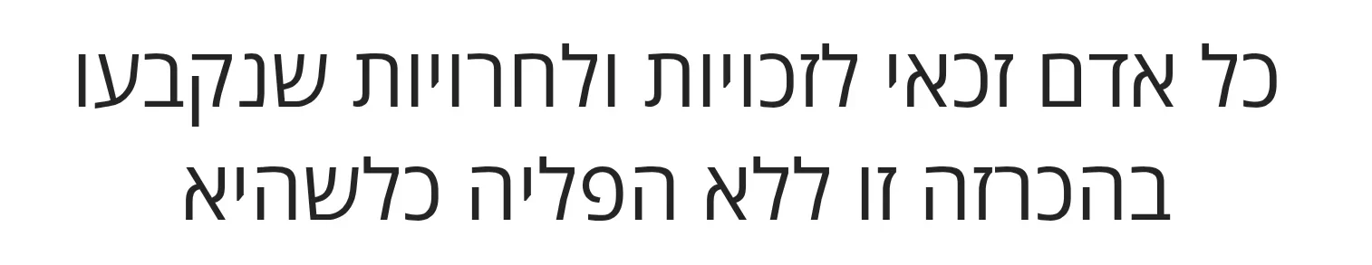
Boring. Both of them. That's the point.
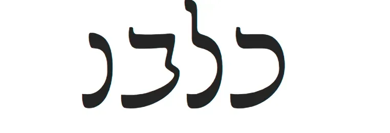
With a bit more personality
Heebo, Suez One, Fredoka, M PLUS Rounded 1c.
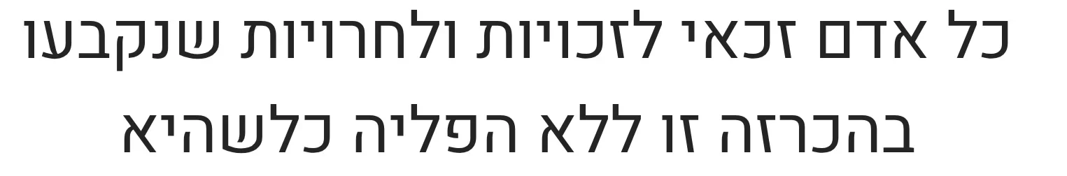
Heebo is Oded Ezer's Hebrew companion to Roboto, and it's the font I'd default to for any modern Hebrew interface — clean, high-contrast, well-spaced, unmistakably contemporary. It is, in my mostly-unqualified opinion, the best free Hebrew sans on the internet.
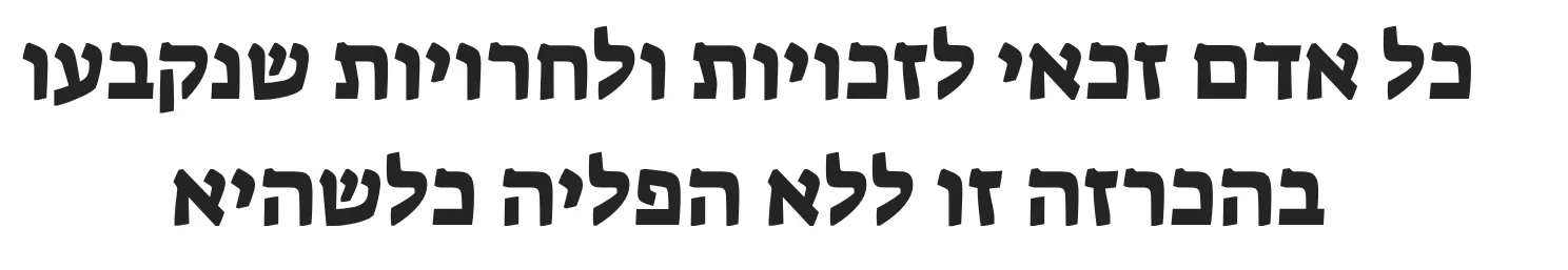
Suez One has more swagger. It's a chunky display face, the sort of thing you'd put on a poster for a falafel stand that takes itself slightly too seriously. Fredoka is its rounder, friendlier cousin — pleasant for kids' content and friendly UIs. M PLUS Rounded 1c is technically a Japanese font that happens to ship with a fine Hebrew subset, and it has the soft, even-tempered roundness of a typeface designed to be quiet on a screen.
Formal and liturgical
Frank Ruhl Libre, Cardo, Tinos.
Frank Ruhl Libre is a digital revival of Raphael Frank's 1908 Frank-Ruehl, which is to Hebrew what Times is to English — the font you've read more of than you realise, even if you've never knowingly looked at it. The Libre version is the one I'd reach for to set a long bilingual document, a Hagaddah, a programme. It carries weight without showing off.
Cardo is David J. Perry's classical-scholarly serif — designed for biblical and academic typesetting, with the cantillation marks and vowel pointing properly handled. Tinos is the Liberation-equivalent of Times New Roman, which is to say: it'll do, and it has a Hebrew subset, and sometimes that is exactly what you need.
Handwriting
Gveret Levin, Solitreo, Playpen Sans Hebrew.
Gveret Levin is the cursive Hebrew of school exercise books. It's slightly perfect, in the way that any handwritten font is slightly perfect — too consistent to be real handwriting, but evocative enough that it triggers the right associations. Useful for tone, terrible for body copy.
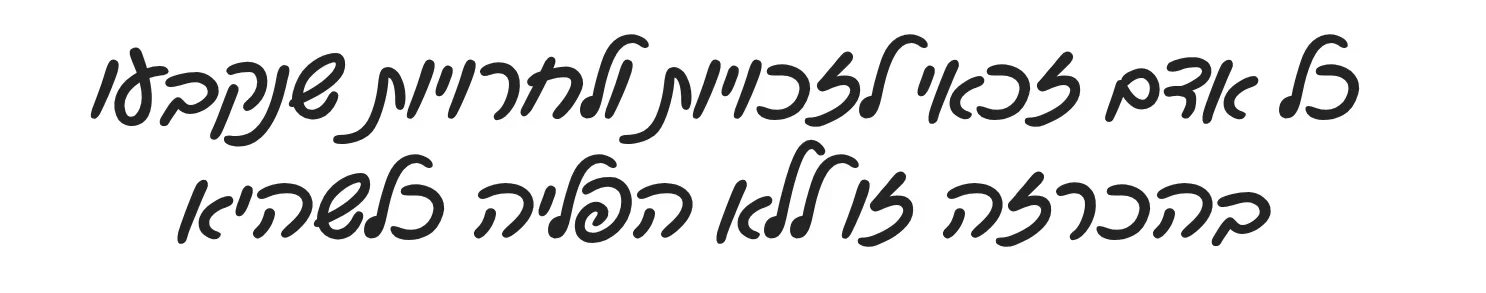
Solitreo is the more interesting one. It's a revival of the cursive Hebrew script used by Sephardic Jews for centuries — the script of letters and ledgers and personal correspondence across the Mediterranean and the Ottoman world. Most digital Hebrew presents itself as either modern or biblical; Solitreo lives in the historical register that connects them.
High legibility
Alef, Secular One, Bellefair.
Alef, by Mushon Zer-Aviv, is what I'd give to a designer who said "I need a Hebrew font that disappears". It's the typographic equivalent of a well-pressed white shirt. Bellefair is more characterful — a serif that pairs well with Latin classical typography. Secular One is a heavy, stable display weight, a useful counterpart to Suez One when you want something less aggressive.
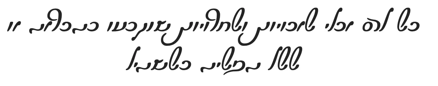
The deliberately weird
Now we leave useful and enter fun. (Most of these will never appear in anything I produce, professionally speaking. They will, however, appear in birthday cards and side projects, which is also a perfectly respectable use of typography.)
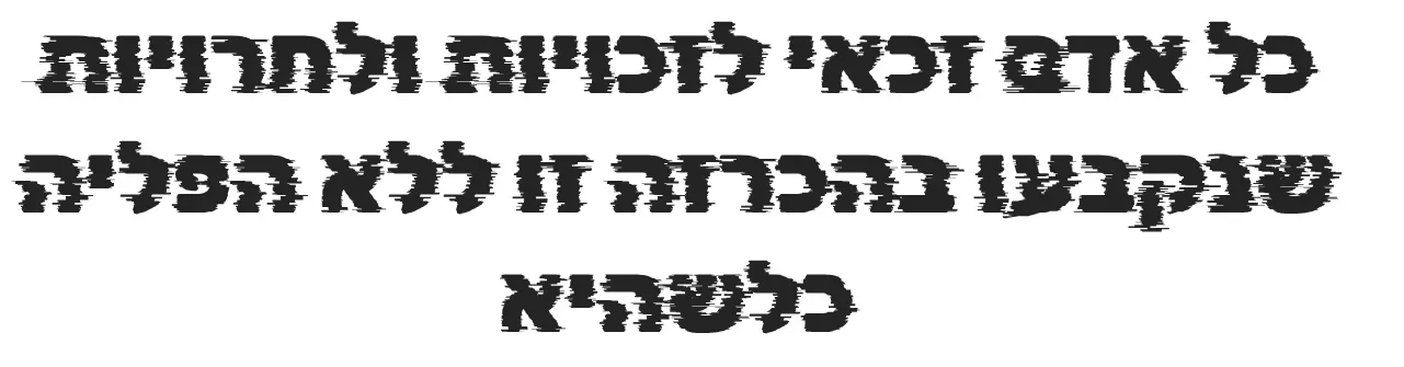
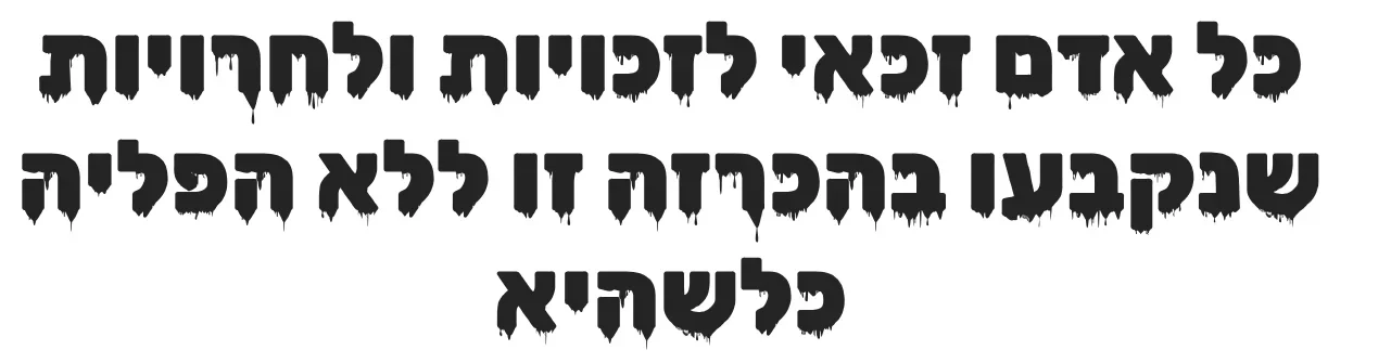
The Rubik family has spawned a small ecosystem of display variants — Rubik Wet Paint, Rubik Dirt, Rubik Glitch, Rubik Moonrocks, Rubik Iso, Rubik Gemstones — most of them by Natalia Raices. Each one is a Rubik skeleton dressed in a particular gimmick. Glitch literally glitches. Wet Paint drips. Moonrocks are pitted and cratered. Gemstones look like they're made of gemstones. They are absurd, and I love them.
Handjet, by the Rosetta foundry, is in a different category — a parametric pixel font you can dial in along multiple axes (resolution, dot size, weight). Brilliant for retro display work and oddly hypnotic to play with.
A monospace
Hebrew monospace fonts are rare for a reason: monospacing requires fixing every glyph to the same width, which fights against Hebrew's natural visual rhythm. Most attempts produce something that's technically a monospace and aesthetically a war crime.
Cascadia Code is the exception — Microsoft's terminal font, with Hebrew glyphs by Liron Lavi Turkenich. If you want to see Hebrew comments in your code editor without flinching, this is the one. (You probably don't want Hebrew comments in your code. But it's nice to know you could.)
And, finally, Rashi
Noto Rashi Hebrew.
Rashi script is the semi-cursive used in rabbinic commentary — a thousand-year-old typographic tradition that, until very recently, had essentially zero presence in mainstream digital tooling. Noto Rashi Hebrew is part of Google's Noto project (the one whose mission is "no tofu" — no missing-glyph boxes — across every script Unicode supports). Having a properly designed Rashi font available on the open web is, quietly, one of the more meaningful things Google Fonts has done for Hebrew typography. It costs them nothing. It matters quite a lot.
The list, the installer
The full list — about thirty fonts across eleven categories, with an interactive installer that pulls them straight from the Google Fonts CDN — lives at github.com/danielrosehill/Awesome-Hebrew-Fonts. Run ./install.sh for a terminal menu, ./gui.sh for a graphical one, or ./install.sh --all if you want to skip the picker and install everything.
Collection of Hebrew fonts, installer for Google Font distributed versions, and some resources
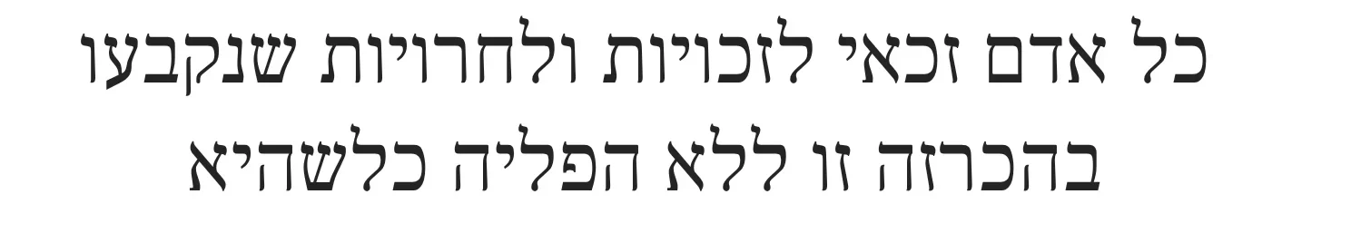
If you spend any time setting bilingual Hebrew–English text, the difference between a properly drawn Hebrew typeface and a badly extended Latin one is not subtle. It's the difference between a document that reads like Hebrew and a document that reads like a translation. Worth the half-hour of installing fonts.
